Nordstrom Anniversary Sale 2015
Nordstrom Anniversary Sale 2015
Overview
Nordstrom's largest sale event, the Anniversary Sale, is held each year in July. Prior to 2015, only Nordstrom cardholders could browse and purchase sale items during Early Access, while non-cardholders had to wait a week until the sale opened up to the public. Product management and UX were tasked to design a new experience that allowed everyone to view Anniversary Sale items while gating purchases to only Nordstrom cardholders during Early Access. I was focused on creating a new mobile app experience for iOS and Android while closely collaborating with my desktop UX counterpart, to ensure a cohesive experience across channels.
Results
2015 proved to be a record breaking Anniversary Sale across all channels for the company but the mobile apps saw the largest growth with traffic increasing by 350%. The first day of Early Access sales demand on iPhone grew 324% compared to 2014 and represented 25% of the entire demand on the app from Anniversary 2014. Conversion rate on the app averaged 8.3%, a 75% increase from 2014. Finally, the “Sneak a peek” preview that allowed non-cardholders to view Early Access, increased the number of credit card applications by 18% compared to 2014.
Partners
UX Writing, UX Research, Product Management, Engineering
Roles
User Experience, User Interface, Prototyping, Visual Design, Production
Adapting to a project in flight
When I joined the project, my UX colleague was already a couple of months into the discovery process. The existing driving questions, problem statements, and hypotheses helped me understand what the underlying problem was that we were trying to solve.
The core team was still in the process of deciding which experience to go forward with, based on the level of effort. Attending these core war rooms before my work started, helped me to become immersed in the project and understand any future limitations or pitfalls in the user experience.
We knew that there would be some differences in the experience between the mobile apps and web, so I worked on user flows to understand how different customer segments would go through the mobile experience.
Ideation

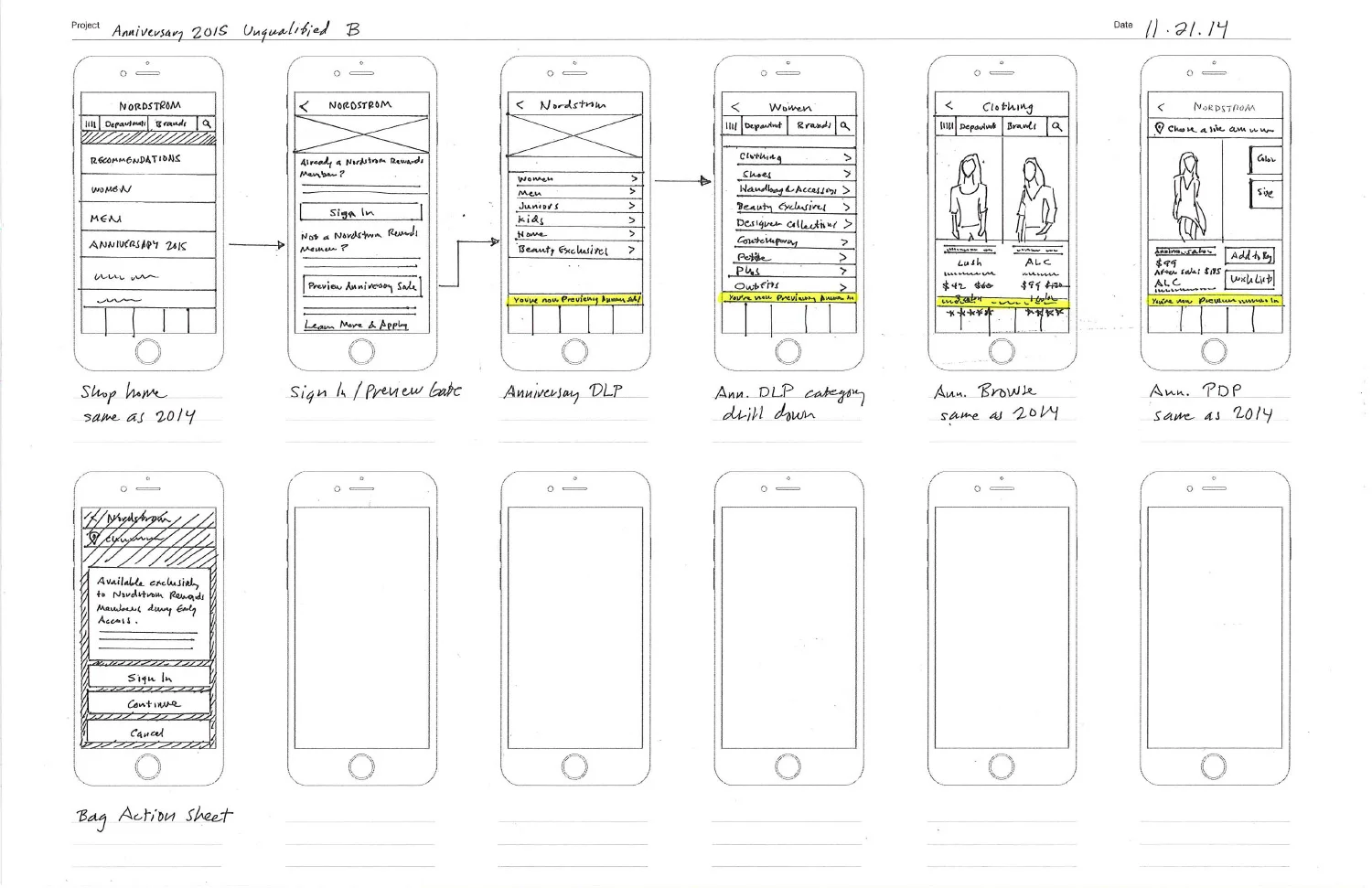


Since there were so many user scenarios and experiences, I decided to sketch out my ideas on paper. I was able to iterate many ideas quickly, while not being constrained by perfect, finalized comps. This also helped my stakeholders focus on the experience itself and not on how the pages looked.
Given the complex rules around Early Access, it was a challenge to fit all of the call to action buttons on the app product page. The mental model of how the Early Access product pages behaved was so different from what customers expected. I sketched some early concepts of a singular button that would reveal an action sheet to more clearly articulate each option available to the different customer segments.
Learning from Usability
While in the sketching phase, my desktop UX counterpart was ready to test some of her first Early Access designs. The first research study was designed to collect feedback on the usability and general understanding around the Early Access rules, especially for non-cardholders.
I observed five participants over the course of three days and while the early part of the customer experience went well, there were high severity issues that affected one of the most important parts of the journey, the product details page. The responses from participants about the product page ranged from confusion to frustration, feelings of being misled, and even anger.
The desktop design put too much cognitive load on the customer, and we weren’t able to clearly articulate each option available to them at a crucial decision point. Cardholders didn’t understand how to confirm their cards and Non-cardholders felt like their only option was to apply for a credit card.


What customers were expressing was: “I want that dress!” so I worked with my UX writer and we translated that sentiment into a call to action button, “I want it”. This idea set expectations that something different would be happening, instead of the usual “add to bag”.
My desktop UX counterpart adapted my mobile action sheet concept and applied it to her product page. While there were more buttons and supporting copy, the design was easier to parse and customer options were clearly laid out.
Usability Testing


The second research study was a remote test with 32 participants, half cardholders and the other half non-cardholders. The response was remarkably improved from the last study, as customers now appreciated a more visible wish list option, which minimized the “push” to apply for a credit card. 87% of the participants felt it was very easy to understand how Early Access worked on mobile.
After a third usability session with no major concerns arising, I moved on to higher fidelity comps and presenting to stakeholders, product management, and developers in numerous wall walks. The wall walks are excellent forums for presenting long flows and soliciting quick feedback from stakeholders.
Final Comps
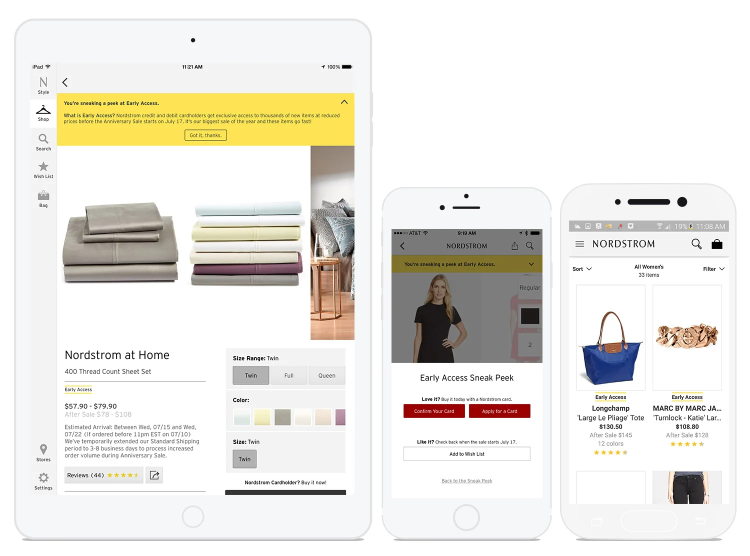
The final iteration of the product page included an informational banner that would be expanded by default on the first page view and collapse automatically when the user scrolled down. The custom action sheet was refined to further simplify the overall information hierarchy.


The iPad and iPhone apps had completely separate code bases and UI patterns, so the iPad incorporated design elements and patterns from both the iPhone and desktop.


Android adopted the iPhone screens with only minor adjustments needed for the Android UI.