Nordstrom Rewards
Nordstrom Rewards
Overview
The original Nordstrom Rewards program launched in 2000 as a tender-based program in an effort to build customer loyalty. In 2014, Nordstrom piloted a program called Debut Rewards in a handful of Full Line Stores in Texas. Debut Rewards allowed customers who didn’t have Nordstrom tender, a way to earn points and rewards using any form of payment by self-identifying in store using their mobile number. I was part of a small, core team of UX designers and product managers that helped define what the next version of Debut Rewards would be and roll the new program out nationwide.
Results
The new Nordstrom Rewards program launched nationwide on May 18th, 2016 and 33 days after the launch, Nordstrom had achieved 1,000,000 new member enrollments. Today, the program is called “The Nordy Club” and as of 2019, has 11.7 million customers enrolled.
Partners
UX Writing, UX Research, Product Management, Engineering, Loyalty, Executive Team
Roles
User Experience, User Interface, Prototyping, Visual Design, Production
Upon joining the Rewards team in 2015, the company was already running a pilot Debut Rewards program in select Texas Full Line Stores. Debut Rewards allowed customers to enroll in the program and earn points in-store, by simply using their mobile number at the register.
The pilot only ran in a few stores, so when the program was planning a nationwide expansion, the business wanted customers to be able to redeem both online and in-store. The Product team created customer journeys: learn, enroll, earn, redeem, and manage. The Rewards UX team included two other designers and I would be responsible for the “earn” track across nordstrom.com and customer mobile apps.
My first task was figuring out how customers would self-identify in checkout online. While Rewards was related to payments, the payments section was already very long and we already ask the customer for a lot of information.
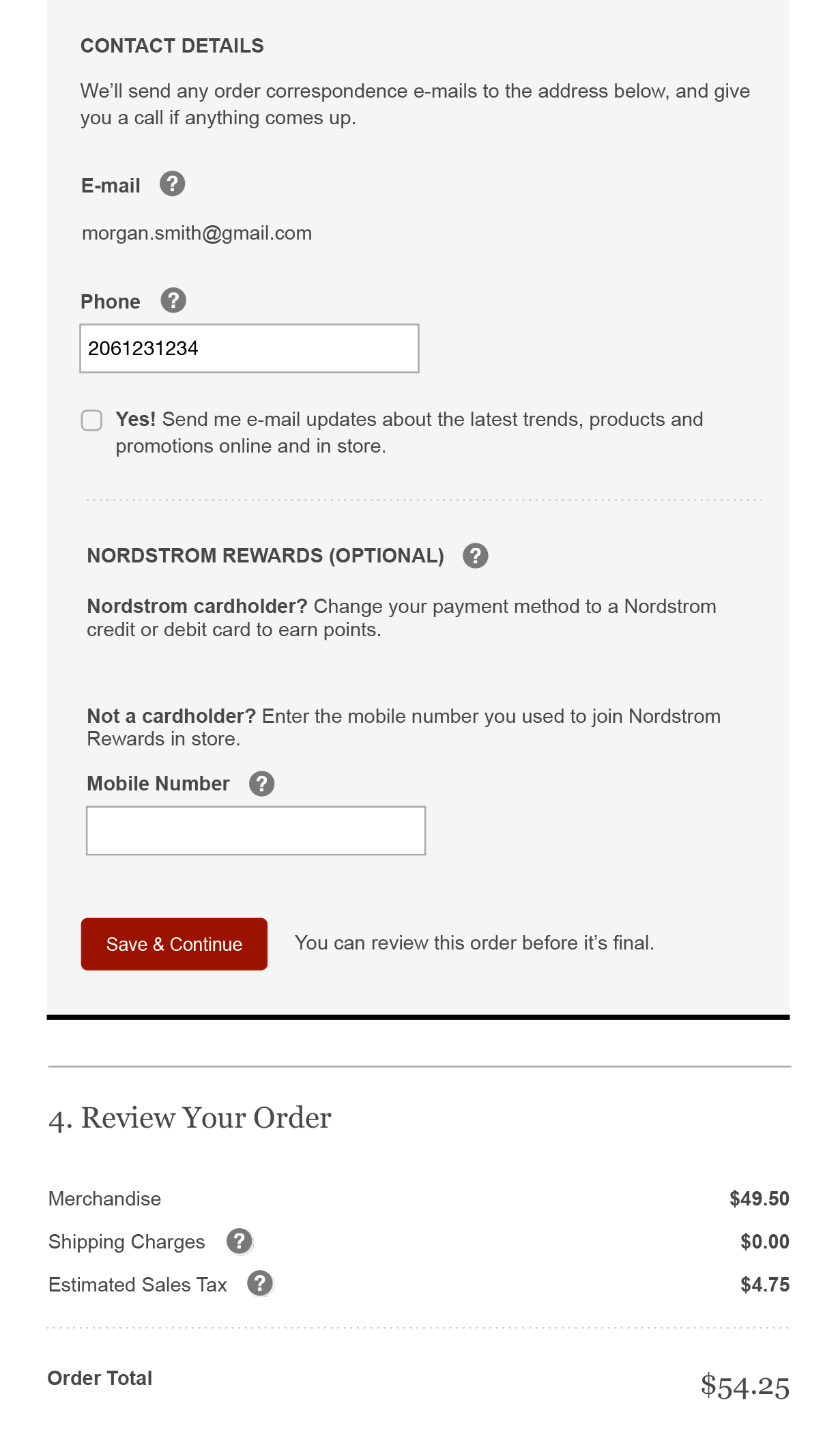
In my first design, I chose to separate the Rewards section and kept it simple by asking only for a mobile number. A few issues arose with this design: it was copy heavy, we were forcing customers who weren’t interested in rewards to have to make a choice, and unlike all of the other sections in checkout, there were two call to action buttons.
I iterated my designs over the next few months through peer reviews, wall walks, and three usability studies. My stakeholders suggested that the payments section was the right place for rewards, but my original concerns about overloading the payments section were playing out in the various usability studies. Additionally, it was awkward to ask a customer for their phone number twice in the same section.
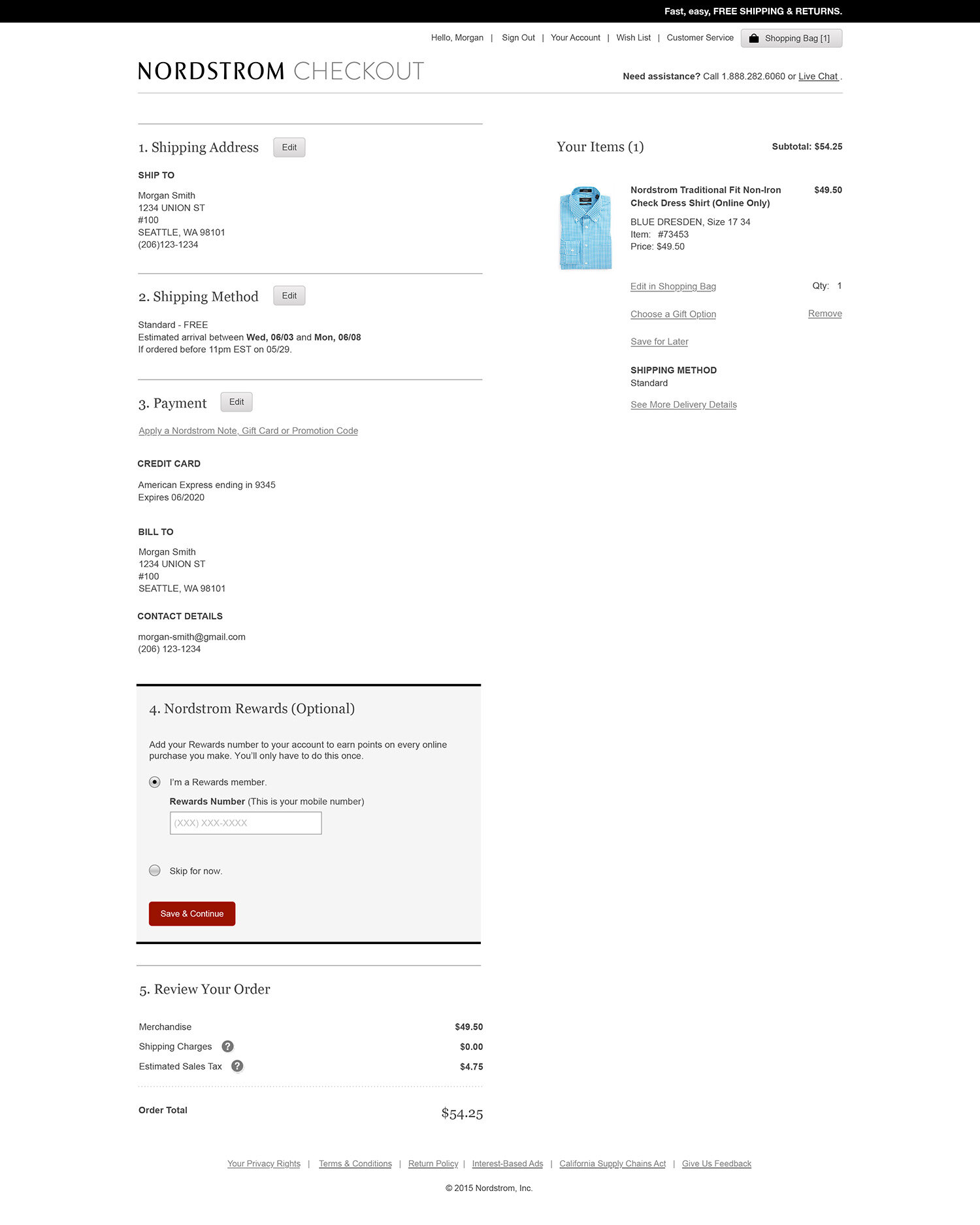
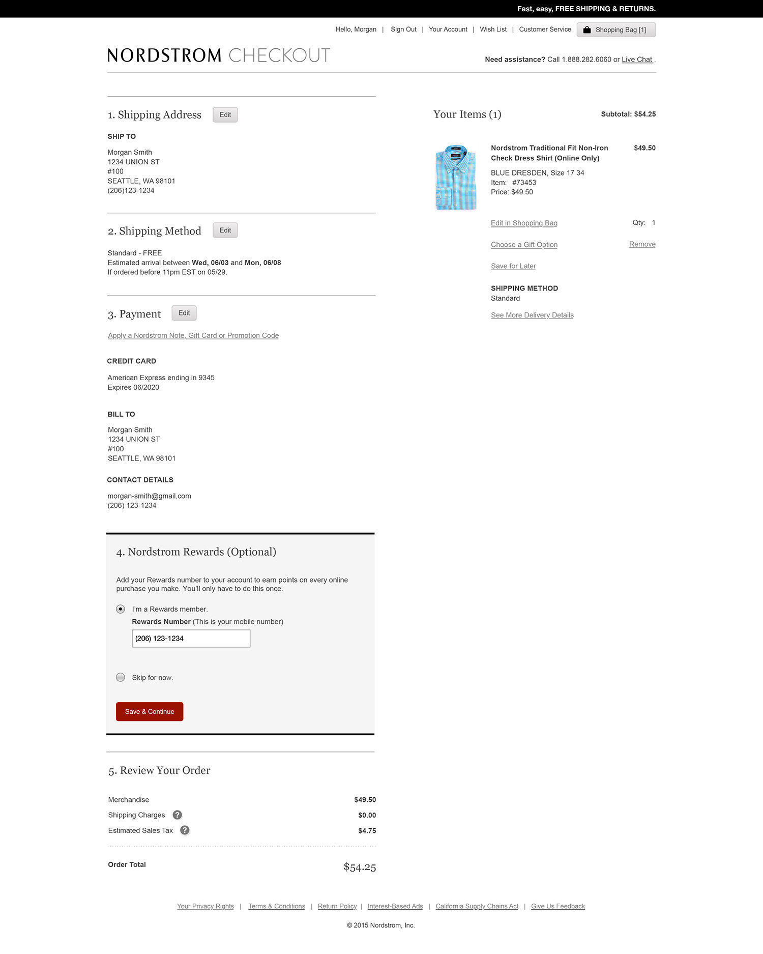

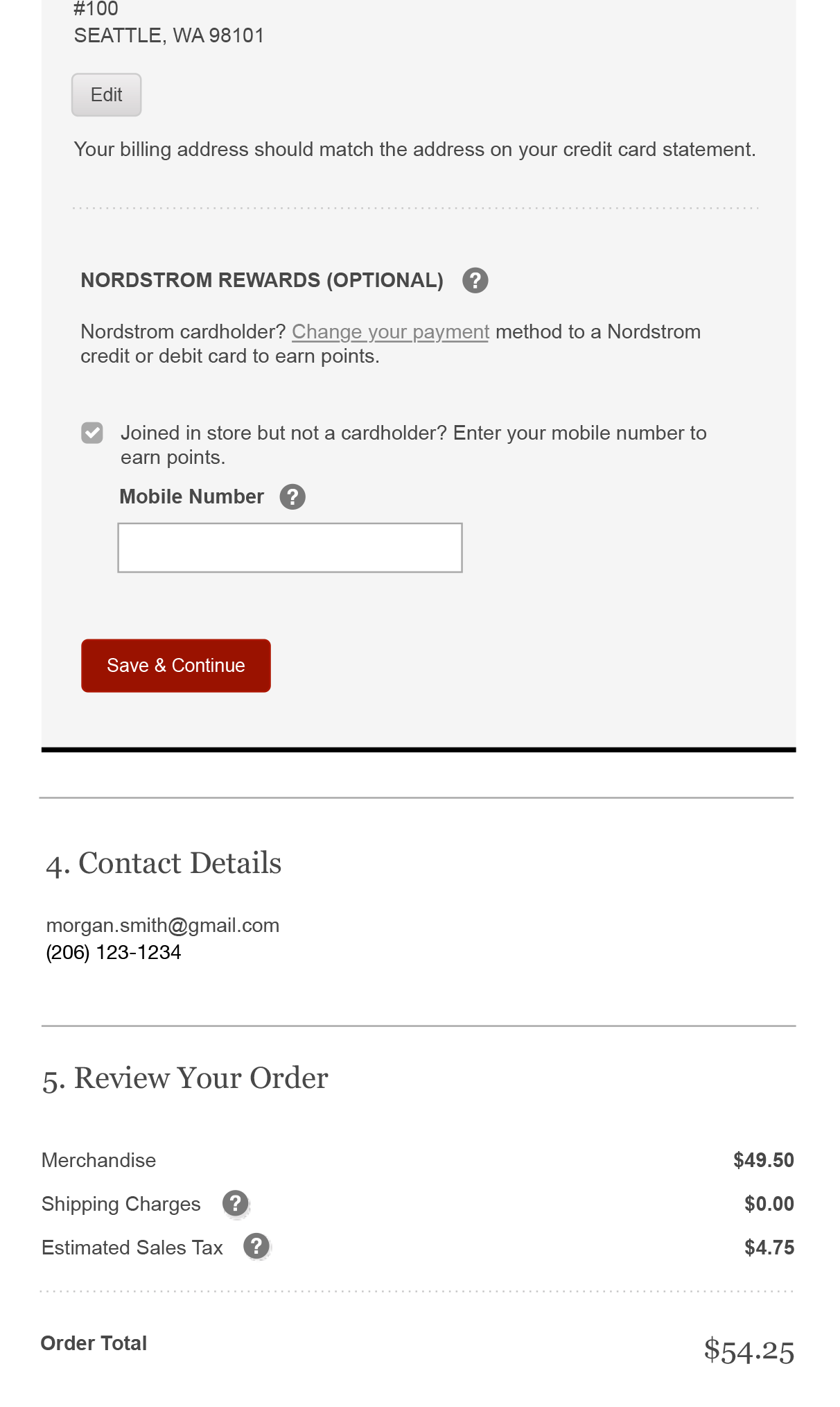
The final MVP design moved the Rewards section out of Payments and reverted back to an optional standalone section. We created two clear entry points, one for cardholders and another for non-cardholders. I was able to eliminate having two call to action buttons, while still allowing an escape mechanism for those who weren’t interested.
The final checkout screens adapted for iPhone and iPad.
Milestone 2 (M2)
With MVP launched, the team quickly pivoted to focus on Milestone 2 (M2). Product needed to get sign off from the business to proceed with the next phase. One of the biggest objectives for M2 was to migrate all of the existing cardholder members to the new, modernized loyalty platform. Product needed a simple way to convey what backend elements would be changing and why the work was necessary. I worked with my product and tech partners to understand how the backend systems worked, and created a series of illustrations to represent current and future state systems.
I also created a storyboard to illustrate how the new customer facing M2 features would enhance the customer experience. These illustrations were used in wall walks with executives and played a crucial role in getting the green-light to proceed with M2.
With all the M2 features decided and prioritized, I would now be responsible for the entire customer journey across nordstrom.com, mobile web, and customer mobile apps.
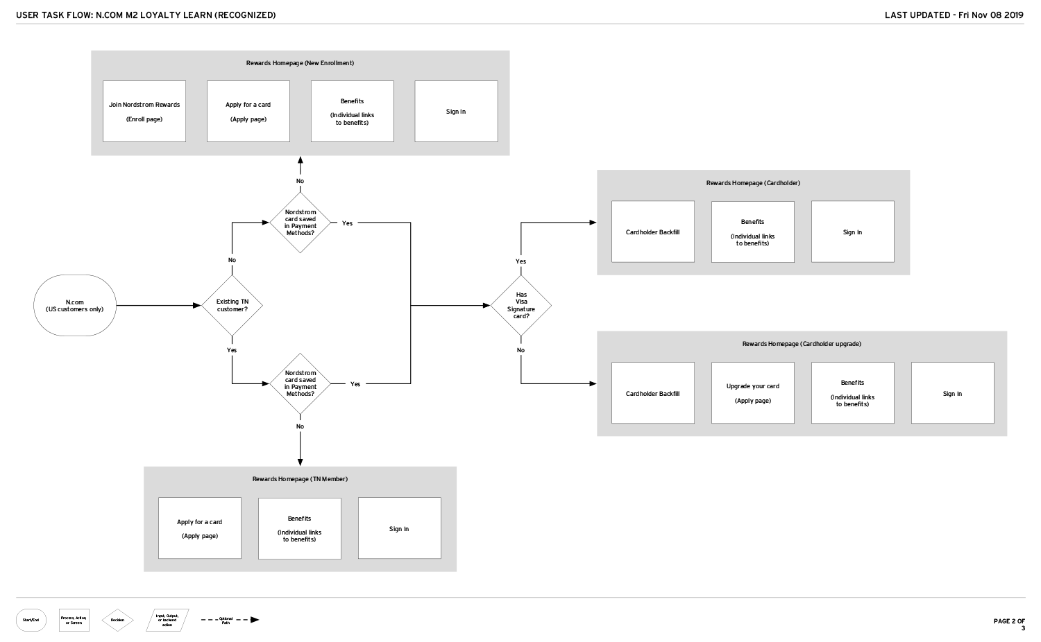
I created user flows with my product partners to help identify new screens, modifications needed from MVP, and to illustrate how different customer segments would go through M2 experience.
One fast follow feature we wanted after MVP was the ability for customers to enroll within checkout. I began to modify the MVP flow to include enrollment, but I was finding that interactions felt strange and it was frustrating for customers to have to input information they had already provided earlier in the flow.
Another challenge was that in order to look up or enroll a customer into rewards, an action had to be taken on the page for the look up to occur. With the previous design, that would have meant adding new buttons back into the main checkout flow.
For M2, I decided to revisit how customer interact with Rewards in checkout. I opted for a modal, which had the benefit of giving customers confidence that engaging with Rewards would not interrupt checking out. To make the experience easier, we would also pre-fill previously provided name and email information.
With the MVP launch, we were seeing that some customers were still missing the Rewards section. Nordstrom cardholders were not confused by the new Rewards section, so I wanted to create a clear path for customers who wanted to enroll and another path for customers who signed up for Rewards in a store. Working with my UX writer, we created more distinct entry points that would explain the benefits without being overly copy heavy.


An unmoderated, online study was conducted prior to the M2 launch to validate the new designs. 24 customers were tasked with creating a new account, associating a store enrolled account, or checking out with their Nordstrom cards.
Every participant, regardless of scenario, was able to check out while earning points on their order. A majority of participants completed their tasks quickly and efficiently.


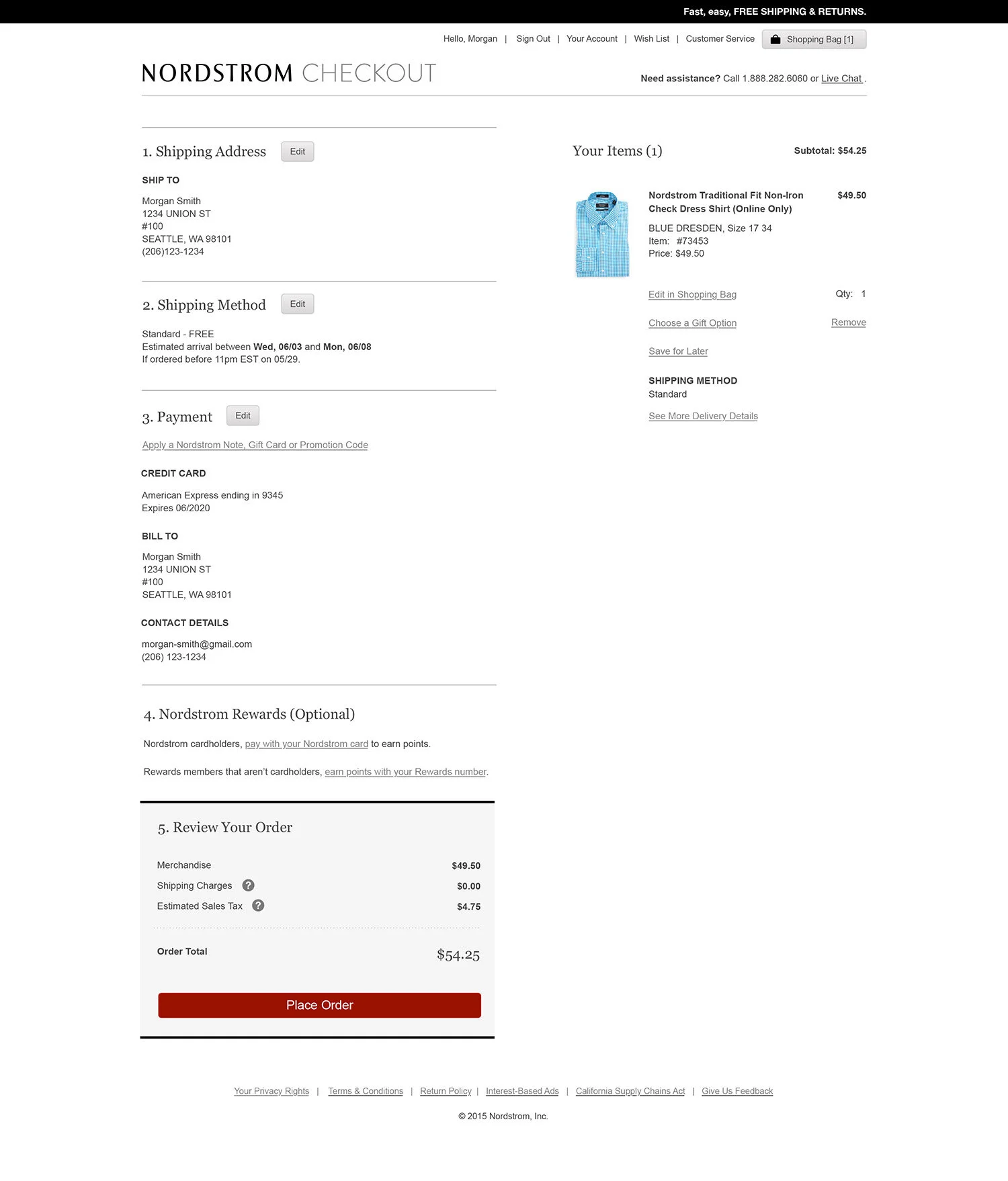
The final M2 checkout screens for desktop.


